
I would like to give a shoutout to Numbers, which remains an essential tool on all my Apple products.
It took minimal clicks to get some really fancy, legible, and engaging charts into my SLO data tracking project for the school year.
Listeners of my podcast will remember Ben Denne and I talking all about our Music Mastery Sequence, and the tool he built to track it. In his more recent podcast appearance, we followed up on this subject, explaining how we have moved away from FileMaker and towards other tools.
My current method for tracking student progress is a giant Numbers spreadsheet with clickable star icons for how many "stars" they earn on each performance. I am using Craft to give students more transparent, informal, and qualitative feedback about what they should be working on.
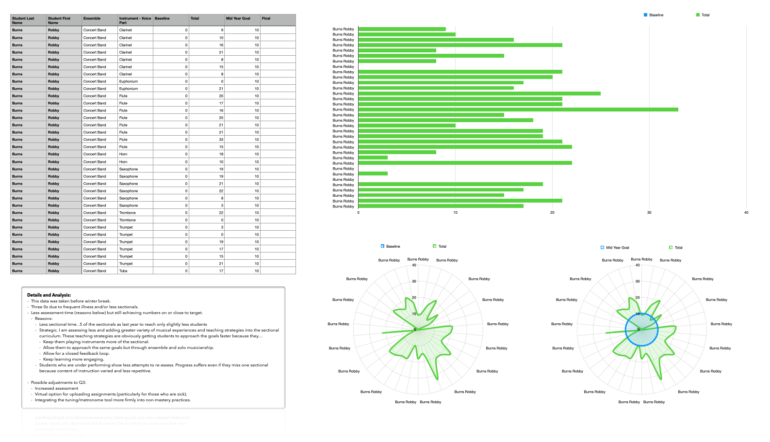
This same Numbers spreadsheet was able to pump out the above table, graph, and charts. Their graphical nature and intuitive ease allowed me to better understand my own shortcomings in this process and what resources, changes, and school supports I needed to make improvement. This helped me to construct a meaningful narrative in a recent SLO meeting.
I hope to cover Numbers and Craft in greater detail later on down the road, as well as my successes in teaching instrumental music performance at an individualized level. If you want more on this, I certainly recommend the hyperlinked podcast episodes above.